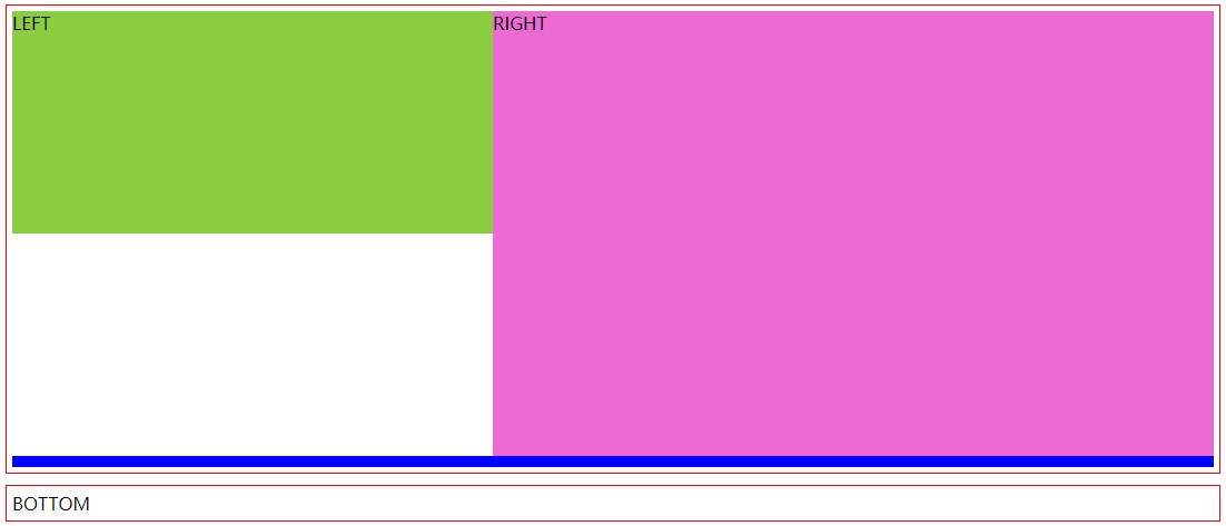
先看一看最终的效果图:
上图中,布局采用了上下布局,而上面部分采用左(LEFT)右(RIGHT)布局。上面部分的布局中的红色边框是左右布局的外部容器,它的高度自适应了 LEFT 或 RIGHT 的最大高度。它能够自适应高度完全是因为我们添加了 .app::after{},并且使用 clear: both; 清除了左右布局的浮动效果。
css广告位
实例代码如下:
示例:layout-example1.html <!DOCTYPE html PUBLIC "-//W3C//DTD XHTML 1.0 Transitional//EN" "https://www.w3.org/TR/xhtml1/DTD/xhtml1-transitional.dtd">
<html xmlns="https://www.w3.org/1999/xhtml">
<head>
<meta http-equiv="Content-Type" content="text/html; charset=gb2312" />
<title>布局示例</title>
<style type="text/css">
.app {
min-height: 10px;
width: 80%;
margin-left: 10%;
border: solid 1px red;
padding: 5px;
}
.app2 {
min-height: 10px;
width: 80%;
margin-left: 10%;
border: solid 1px red;
padding: 5px;
margin-top:10px;
}
.app .left {
height: 200px;
width: 40%;
background: yellowgreen;
float: left;
}
.app .right {
height: 400px;
width: 60%;
background: orchid;
float: left;
}
.app::after {
content: '';
height: 10px;
background: blue;
display: block;
clear: both;
}
</style>
</head>
<body>
<div class="app">
<div class="left">LEFT</div>
<div class="right">RIGHT</div>
</div>
<div class="app2">BOTTOM</div>
</body>
</html>👉自己动手试一试 »
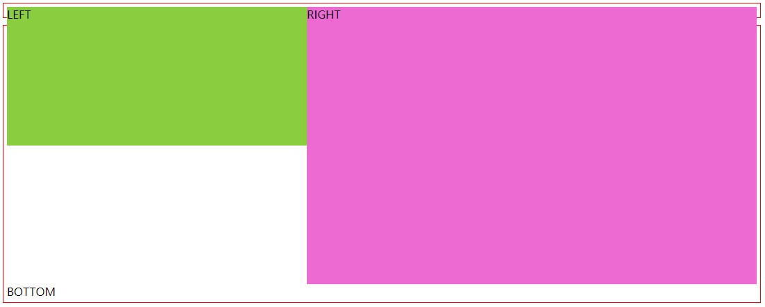
如果我们将 .app::after 样式选择器中的 clear 注释掉,代码如下:
<style type="text/css">
    .app::after {
        content: '';
        height: 10px;
        background: blue;
        display: block;
        /* clear: both; */
    }
</style>
效果图如下:
上图中,上部分的左右布局外部容器没有被自动撑高,这是因为 LEFT 和 RIGHT 采用了浮动布局,脱离了文档流,不占用空间。


 川公网安备51010802032098